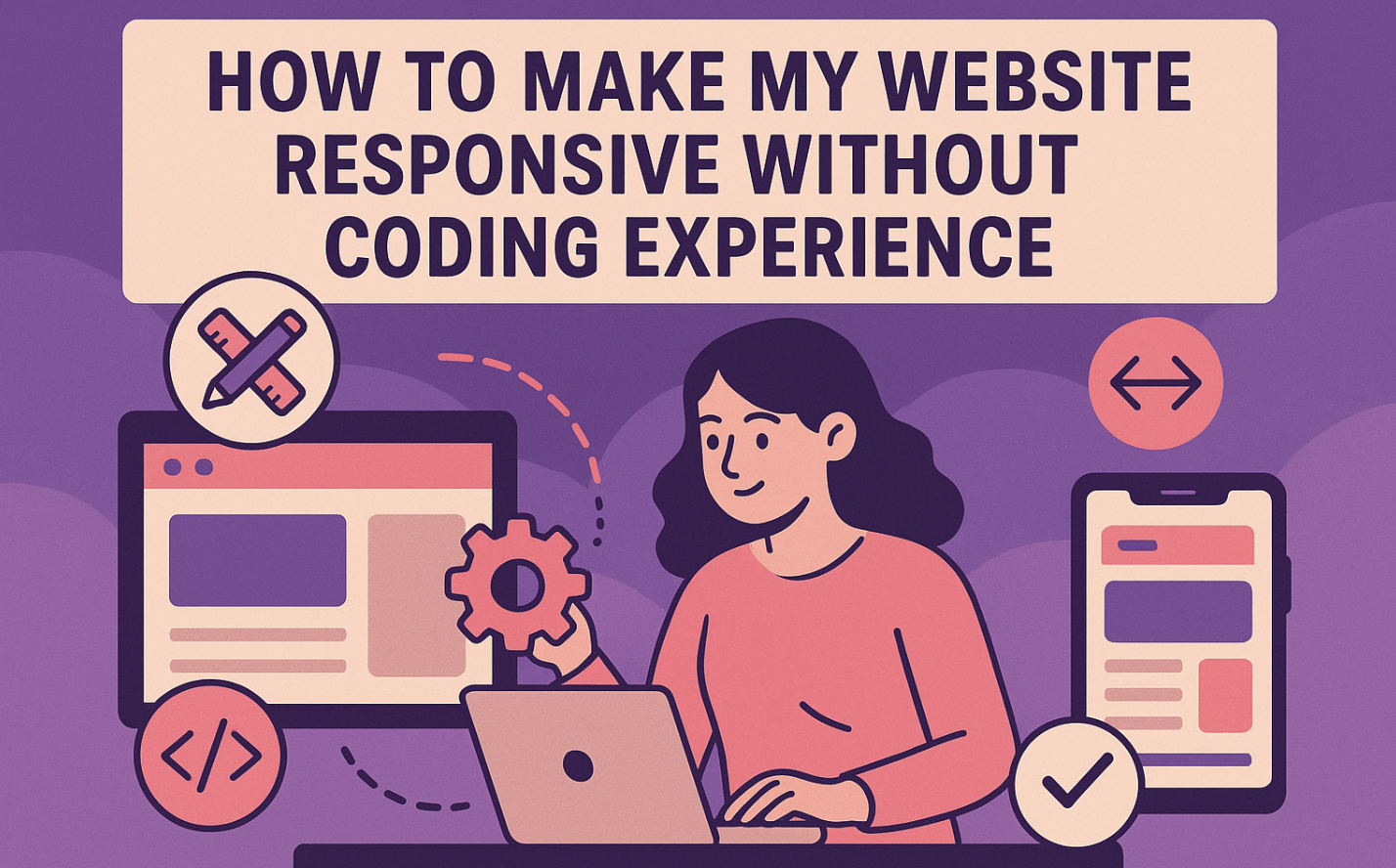
Creating a responsive website might seem overwhelming, especially if you don’t know how to code. But don’t worry—you’re not alone! Many beginners face challenges, such as designing navigation menus that work on all devices or resolving discrepancies between desktop and mobile views. Browser compatibility can also be tricky. The good news? You don’t need coding skills to tackle these issues. With the right tools and techniques, you’ll learn how to make my website responsive and ensure it looks great on any screen.
Let’s get started and make your website user-friendly for everyone!
What Is Responsive Design and Why It Matters
Understanding Responsive Design
What does “responsive” mean for a website?
When you hear the term “responsive” for a website, think of it as a site that adapts to any screen size. Whether someone visits your site on a desktop, tablet, or mobile phone, it adjusts automatically to fit their device. This means no awkward scrolling or zooming to read content. Instead, everything looks clean and organized, no matter the screen size.
Responsive websites rely on a few key principles to work their magic. They use fluid grids, which adjust the layout based on the screen size.
Images and media scale flexibly, so they don’t look stretched or squished. CSS media queries help apply specific styles depending on the device’s width or orientation. These elements work together to create a seamless experience for your visitors.
How responsive design improves user experience
A responsive design makes your website easy to navigate, which keeps visitors happy. Imagine landing on a site where the text is too small or buttons are hard to click. Frustrating, right? A responsive website eliminates these issues. It ensures your content is accessible and visually appealing on all devices.
This improved user experience builds trust and loyalty. Visitors are more likely to stay on your site longer and return in the future.
Plus, faster load times and better accessibility make your site even more enjoyable to use.
Why Responsive Design Is Important
The rise of mobile users and its impact on websites
Did you know that over 60% of web traffic now comes from mobile devices? With so many people browsing on their phones, having a responsive website isn’t optional—it’s essential. If your site doesn’t work well on mobile, you risk losing a huge chunk of your audience.
Mobile users expect fast load times and easy navigation. A responsive design ensures your site meets these expectations, keeping visitors engaged.
How responsiveness boosts SEO and search rankings
Search engines like Google prioritize responsive websites in their rankings. If your site isn’t mobile-friendly, it could hurt your SEO efforts. A responsive design improves your site’s performance, which search engines love. Faster load times, better usability, and lower bounce rates all contribute to higher rankings. This means more visibility and traffic for your site.
In short, a responsive website isn’t just good for users—it’s great for your business too.
Tools to Make a Responsive Website Without Coding
Drag-and-Drop Website Builders
Popular platforms like Wix, Squarespace, and Webflow
Drag-and-drop website builders are perfect if you want to create a responsive website without coding. These tools let you design by simply dragging elements like text boxes, images, or buttons onto your page. No coding knowledge is required! Here are some popular platforms you can explore:
-
Wix: Known for its simplicity, it’s like building with digital Lego blocks.
-
Squarespace: Offers a sleek, intuitive interface that’s easy to use.
-
Webflow: Combines visual design with coding concepts, great for learning while creating.
-
WordPress with Elementor: A favorite for its user-friendly interface and large community support.
How these tools simplify responsive design
These builders make responsive design a breeze. They include pre-designed components optimized for all screen sizes. You can visually edit layouts and see real-time feedback on how your site looks on different devices. Many platforms also offer tutorials and community support to guide you.
Plus, they allow you to integrate third-party apps for added functionality. With these tools, you have flexibility and control to customize your site to match your brand.
Pre-Designed Responsive Templates
What are responsive templates?
Responsive templates are pre-built website designs that automatically adjust to fit any screen size. They save you time and effort since the layout, fonts, and images are already optimized for desktops, tablets, and smartphones. You just need to add your content, and you’re good to go!
Where to find and how to use them
You can find high-quality responsive templates on platforms like WebWave, which offers nearly 100 free options. These templates use modern responsive design techniques to ensure your site looks great on all devices. Once you choose a template, customize it by adding your text, images, and branding.
It’s that simple!
Plugins and Add-Ons for Existing Websites
WordPress tools like Elementor and Divi
If you already have a WordPress site, plugins like Elementor and Divi can help make it responsive. Elementor offers drag-and-drop functionality, while Divi provides a visual builder with responsive editing tools. Both are beginner-friendly and packed with features to enhance your site’s design.
Enhancing responsiveness with plugins
Other plugins can also improve your site’s responsiveness. For example:
-
Jetpack: Boosts performance and includes mobile theme customization.
-
WPtouch: Automatically adds a mobile-friendly theme, recommended by Google.
-
WP Responsive Menu: Creates dropdown menus for better navigation on small screens.
-
AMP for WP: Speeds up loading times on mobile devices.
These plugins ensure your site works smoothly on any device, improving user experience and SEO.
Step-by-Step Guide on How to Make My Website Responsive
What You Need to Get Started
Choosing the right platform or tool
The first step in creating a responsive website is selecting the right platform or tool. Drag-and-drop builders like Wix, Squarespace, and Webflow are excellent for beginners. They offer pre-designed components that adapt to different screen sizes. If you prefer more customization, frameworks like Bootstrap or Tailwind CSS provide responsive grids and layouts.
Here’s a quick comparison of popular frameworks:
|
Framework |
Description |
|---|---|
|
Bootstrap |
A popular open-source framework with responsive components and grid systems for fast development. |
|
Foundation |
Known for its flexible grid system and mobile-first approach. |
|
Bulma |
A modern CSS framework based on Flexbox, offering simplicity and clean design. |
|
Materialize |
Built on Google’s Material Design principles, focusing on sleek, minimalistic layouts. |
|
Tailwind CSS |
A utility-first framework for creating responsive designs with customizable CSS classes. |
Preparing your website content and images
Before diving into design, organize your content and images. Use high-quality visuals and set their maximum width to 100% so they scale proportionally. For better performance, use srcset to serve different image sizes based on the user’s device. Break your content into sections that are easy to read on smaller screens. Testing your content layout on mobile devices ensures it’s user-friendly.
Setting Up a Responsive Website
Selecting a responsive template or theme
Choose a responsive template or theme that matches your website’s purpose. Platforms like Wix and Squarespace offer templates optimized for mobile, tablet, and desktop views. These templates save time by handling the technical aspects of responsive design for you.
Simply customize the colors, fonts, and images to align with your brand.
Using drag-and-drop tools to arrange content
Drag-and-drop tools make it easy to arrange your website’s layout. You can move elements like text boxes, images, and buttons to create a visually appealing design. These tools also let you preview how your site looks on different devices. Many platforms include pre-designed components that ensure responsiveness, so you don’t have to worry about coding.
Adjusting for Different Screen Sizes
Setting breakpoints for mobile, tablet, and desktop views
Breakpoints are specific screen widths where your website’s layout adjusts to improve usability. For example, you might set a breakpoint at 768 pixels for tablets and 480 pixels for mobile phones. Use CSS media queries to define these breakpoints and apply styles that fit each screen size. This ensures your content looks great on any device.
Using fluid grids and flexible layouts
Fluid grids and flexible layouts are essential for responsive design. Instead of fixed units like pixels, use percentages or viewport units to define widths. For instance, setting width: 50%; ensures an element takes up half the width of its container, regardless of the screen size.
Combine this with CSS Flexbox or Grid for precise control over your layout. Always test your design on multiple devices to ensure consistency.
Testing Your Responsive Website
Testing your responsive website is a crucial step to ensure it looks and works perfectly on all devices. You don’t want visitors struggling with broken layouts or buttons that don’t work on mobile. Let’s explore some tools and techniques to help you test and refine your site.
Tools to preview your website on different devices
You can use several tools to see how your website performs across various screen sizes. These tools simulate different devices, so you can catch any issues before your visitors do. Here are some great options to try:
-
Responsinator: Quickly view your site in device mockups to check its responsiveness.
-
Am I Responsive?: Offers a simple way to preview your site on multiple screen sizes.
-
Viewport Resizer: A handy bookmarklet that resizes your browser to specific dimensions.
-
Screenfly: Lets you test your site under various screen resolutions.
-
Browser Stack: Provides access to over 1,000 mobile and desktop browsers for testing.
-
CrossBrowserTesting: Allows real-world interaction testing on more than 1,500 devices.
-
Testsigma: Automates responsiveness testing for a wide range of devices.
-
DevTools Device Mode: Built into Chrome, it simulates mobile devices for quick testing.
-
Responsive Design Mode: A Firefox extension for testing different screen sizes.
-
LT Browser: Helps debug and identify responsive design issues.
These tools make it easy to spot problems and fine-tune your site for a seamless user experience.
Making adjustments based on test results
Once you’ve tested your responsive website, it’s time to fix any issues. Follow these steps to make your site flawless:
-
Conduct visual testing. Check the layout, design, and navigation. Ensure everything looks clean and works well on mobile.
-
Test functionalities. Verify that buttons, forms, and interactive elements respond correctly.
-
Use developer tools. Simulate touch events and adjust layouts using device modes.
-
Review performance metrics. Assess loading speed and responsiveness to ensure smooth performance.
-
Document findings. Take notes and screenshots of any problems you notice.
-
Iterate and retest. Make the necessary changes and test your site again to confirm improvements.
-
Conduct regular tests. Keep testing your site after updates to maintain its responsiveness.
These steps will help you create a website that works beautifully on any device, whether it’s a desktop or a mobile phone.
Best Practices for Maintaining a Responsive Website
Regular Testing for Responsiveness
How often to test your website
Testing your website regularly is essential to maintain a great user experience. You should check your site’s responsiveness every time you make updates or add new features. If your site gets frequent traffic, test it monthly to catch any issues early. For less active sites, quarterly testing works well.
Consistent testing ensures your website stays functional and visually appealing across all devices.
Tools for ongoing testing like Google Mobile-Friendly Test
You don’t need to guess how your website looks on different devices. Use tools designed for responsive testing to get accurate results. Here are some great options:
-
DevTools Device Mode: Simulates various devices directly in Chrome.
-
Browser Stack: Offers access to over 1,000 browsers for detailed testing.
-
Responsinator: Displays your site in device mockups for a quick overview.
-
Am I Responsive?: Provides a visual preview of your site on multiple screen sizes.
-
LT Browser 2.0: Lets you test live interactions on mobile and tablet views.
These tools help you identify and fix problems before they affect your visitors.
Optimizing Images and Media
Why image size matters for responsiveness
Large images can slow down your website, frustrating users and hurting your responsive design. Optimized images load faster, improving the user experience. They also adapt better to different screen sizes, ensuring your site looks great on mobile, tablet, and desktop.
Faster load times keep visitors engaged and reduce bounce rates.
Tools to compress and optimize images
You don’t need advanced skills to optimize your images. Use these tools to make your visuals web-friendly:
-
TinyPNG: Compresses PNG and JPEG files without losing quality.
-
Kraken.io: Offers advanced image optimization for faster loading.
-
Compressor.io: Reduces file sizes while maintaining high resolution.
-
Optimole: Automatically resizes and serves images based on the user’s device.
Follow these tips for better results:
-
Use the right file format (JPEG for photos, PNG for graphics).
-
Remove unnecessary metadata from images.
-
Opt for responsive images that adjust to screen sizes.
Common Mistakes to Avoid
Overloading your website with too many elements
Adding too many elements can clutter your site and hurt its responsiveness. Avoid stuffing your pages with excessive text, images, or animations. Focus on clean, simple layouts that enhance the user experience. A minimal design loads faster and works better on smaller screens.
Ignoring user feedback on mobile usability
Your visitors can provide valuable insights into your site’s performance. Collect feedback through surveys or analytics to identify pain points. Use this information to improve navigation, readability, and accessibility. For example, if users struggle with small buttons, make them larger and touch-friendly.
Regularly updating your site based on feedback ensures it meets your audience’s needs.
Potential Challenges and How to Overcome Them
Limited Customization Options
Working within the constraints of drag-and-drop tools
Drag-and-drop tools are great for beginners, but they do have their limits. You might find it hard to create a unique design because these tools rely on predefined templates. They often lack advanced SEO features, which can make it harder for your site to rank well. Some tools struggle with creating truly responsive designs, especially for mobile devices. This can lead to layouts that don’t look quite right on smaller screens. Performance can also be an issue. Drag-and-drop tools sometimes generate bloated code, which slows down your site. This affects loading speed, especially on mobile.
If you’re planning to scale your website in the future, these tools might not adapt well to your needs.
They also offer limited control over security, which could leave your site vulnerable. To work around these challenges, focus on simplicity. Choose a template that aligns closely with your vision to minimize the need for customization. Use plugins or add-ons to enhance functionality. If you need advanced features, consider hiring a professional to handle the technical aspects.
When to consider hiring a professional
Sometimes, the limitations of drag-and-drop tools can hold you back. If you need a highly customized design or advanced features, hiring a professional might be the best option. A developer can create a site that’s fully optimized for mobile devices and tailored to your needs. They can also ensure your site is secure, fast, and scalable for future growth.
If your business relies heavily on your website, investing in professional help can save you time and frustration.
Ensuring Consistency Across Devices
Tips for maintaining a cohesive design
Consistency is key to a great user experience. Start by aligning your design with your goals and audience needs. Use the same colors, fonts, and logos across all pages to create a unified look. Document your design standards so you can refer back to them when making updates. This helps maintain consistency as your site evolves.
When designing for mobile devices, keep things simple. Avoid clutter and focus on clear navigation. Test your site regularly to ensure it looks and works the same on all devices. Tools like Google Mobile-Friendly Test can help you spot inconsistencies and fix them quickly.
Handling unexpected layout issues
Even with careful planning, layout issues can pop up. Maybe a button looks fine on desktop but overlaps text on mobile. To fix this, use flexible layouts and fluid grids. These adjust automatically to different screen sizes. Breakpoints are another useful tool. They let you apply specific styles for mobile devices, tablets, and desktops.
If you encounter persistent issues, revisit your design standards. Check for elements that don’t align with your guidelines. Sometimes, small tweaks can make a big difference. Regular testing and updates will help you catch and resolve problems before they affect your users. Creating a responsive website without coding is easier than you think. Start by understanding the basics of responsive design. Use tools like drag-and-drop builders or pre-designed templates to simplify the process. Follow these key steps:
-
Set media query ranges, like 576px for phones or 1200px for larger screens.
-
Size layout elements with percentages for flexibility.
-
Implement responsive images to ensure they adapt seamlessly.
Maintaining a responsive site has long-term perks. It improves user experience, reduces bounce rates, and boosts SEO. Plus, managing one site saves time and effort. Take the first step today—your audience will thank you.