Editing your WordPress navigation menu might seem tricky at first, but trust me, it’s easier than you think. A well-organized menu acts like a roadmap for your visitors, guiding them to the most important parts of your site. It improves user experience, keeps visitors engaged, and even helps reduce bounce rates. Whether you want to add new pages, rearrange items, or create a drop-down menu, I’ll show you how to edit WordPress menus step-by-step. With the right approach, you can transform your navigation bar into a tool that enhances your site’s usability and appeal.
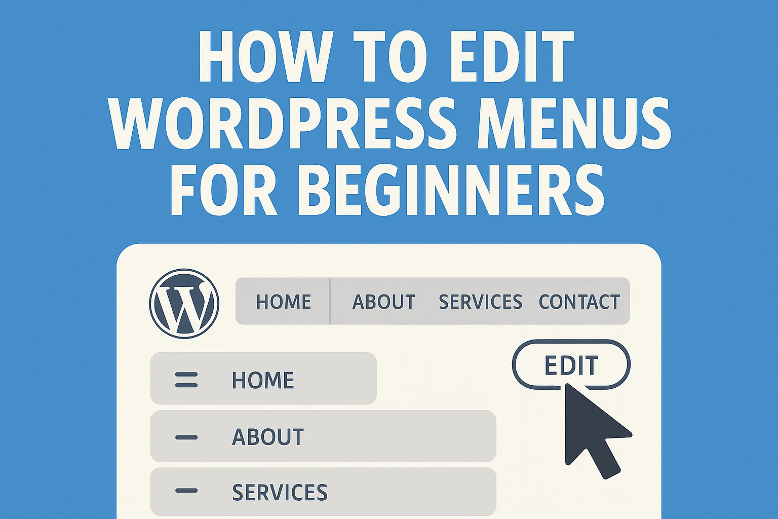
How to Access WordPress Menu Settings
Editing your WordPress menu starts with knowing where to find the right settings. Don’t worry—it’s easier than it sounds. Let me walk you through the process step by step.
Logging into Your WordPress Dashboard
The first step is logging into your WordPress dashboard. This is the control center for your entire website. To access it, open your browser and type in your website’s URL followed by /wp-admin. For example, if your site is www.example.com, you’d enter www.example.com/wp-admin. Once there, enter your username and password.
If you’ve forgotten your login details, use the “Lost your password?” link to reset them.
After logging in, you’ll see the WordPress dashboard. It’s a user-friendly interface where you can manage everything from posts to plugins. The dashboard is also where you’ll find the tools to edit your navigation bar.
Navigating to the Menu Settings
Now that you’re in the dashboard, it’s time to locate the menu settings. WordPress makes this process straightforward.
Using the “Appearance” Tab to Access Menus
On the left-hand side of the dashboard, you’ll see a vertical menu. Look for the Appearance tab—it’s usually near the bottom. Click on it, and a dropdown menu will appear. From there, select Menus. This will take you to the menu editor, where you can view and modify your site’s navigation menus.
If you prefer a more visual approach, you can also access the menu settings through the Customizer. Go to Appearance > Customize, then click on Menus.
This method lets you see changes in real-time as you make them.
Selecting the Menu You Want to Edit
Once you’re in the menu editor, you’ll notice a dropdown list at the top of the page. This is where you can select the menu you want to edit. If your site has multiple menus—like one for the header and another for the footer—choose the one you need. After selecting it, click the Select button to load the menu. If you don’t have a menu yet, don’t worry. You can create one by clicking the Create a New Menu link. Give your menu a name, and then start adding items to it. I’ll cover how to do that in the next section.
Navigating these settings might feel overwhelming at first, but trust me, it gets easier with practice. Once you’ve accessed the menu editor, you’re ready to start customizing your site’s navigation.
Step-by-Step Guide on How to Edit a Menu
Editing a WordPress menu might feel overwhelming at first, but trust me, it’s a straightforward process. Let’s break it down step by step so you can confidently manage your site’s navigation.
Adding New Menu Items
Adding fresh content to your menu is one of the easiest ways to improve your site’s navigation. Whether you want to highlight a new blog post, a service page, or a custom link, here’s how you can add a new menu item.
Adding Pages, Posts, or Custom Links to Your Menu
To add navigation items, start by opening the Menu Editor in your WordPress dashboard. On the left side of the editor, you’ll see options like Pages, Posts, and Custom Links.
-
If you want to add a page, click the Pages tab. Select the checkbox next to the page you want to include, then hit the Add to Menu button.
-
For blog posts, switch to the Posts tab. Choose the post you want and click Add to Menu.
-
To add a custom link, go to the Custom Links section. Enter the URL and a label for the link, then click Add to Menu.
Once added, the new item will appear in the menu structure on the right. You can now move on to customizing its title.
Assigning Titles to Menu Items
Titles are what your visitors see on the navigation bar. To edit a title, click the dropdown arrow on the menu item you just added. In the Navigation Label field, type the name you want to display. For example, instead of “About Us,” you might prefer “Who We Are.” After updating the title, don’t forget to save your changes.
Removing Menu Items
Sometimes, you need to clean up your menu by removing outdated or irrelevant items. Here’s how to edit a menu by getting rid of unnecessary links.
Identifying and Deleting Unwanted Items
In the Menu Editor, locate the item you want to remove. Click the dropdown arrow next to it to expand its settings. At the bottom, you’ll see a red Remove link. Click it, and the item will disappear from the menu structure.
Saving Changes After Removal
After deleting unwanted items, always save your changes. Look for the blue Save Menu button at the top or bottom of the page. Click it to ensure your edits are applied to your site.
Rearranging Menu Items
A well-organized menu improves user experience. Rearranging items allows you to prioritize the most important links and create a logical flow.
Using Drag-and-Drop to Change the Order
WordPress makes it easy to rearrange items with a simple drag-and-drop feature. In the Menu Editor, click and hold the menu item you want to move. Drag it to its new position and release. You can also nest items under a parent item to create a drop-down menu.
Saving Your Updated Menu Layout
Once you’ve rearranged everything, save your updated layout. Again, click the Save Menu button to lock in your changes. Always preview your site after making edits to ensure everything looks as expected.
By following these steps, you’ll know exactly how to edit a menu in WordPress. Whether you’re adding new links, removing old ones, or rearranging items, these tools give you full control over your navigation. A well-structured menu not only enhances usability but also keeps visitors engaged longer.
Customizing and Changing Menus
Customizing your WordPress menu can elevate your website’s navigation and make it more user-friendly. Let’s explore how to create drop-down menus and assign menus to specific locations to enhance your site’s functionality.
How to Create Drop-Down Menus
Drop-down menus are a fantastic way to organize your navigation menu. They allow you to group related items under a parent menu item, creating a clean and structured layout.
Nesting Sub-Items Under Parent Items
Creating a drop-down menu in WordPress is simple. Start by opening the Menu Editor in your dashboard. Once there, follow these steps:
-
Add all the items you want in your menu, including the parent and sub-items.
-
In the menu structure section, drag the sub-item slightly to the right under the parent item. This action will nest it as a child item.
-
Repeat this process for any additional sub-items you want to include.
For example, if you have a parent item called “Services,” you can nest sub-items like “Web Design” and “SEO” under it. This structure creates a drop-down effect when users hover over “Services.”
Adjusting the Hierarchy for Better Navigation
A well-organized hierarchy improves usability. To adjust the order of your drop-down items, use the drag-and-drop feature in the menu structure. Place the most important items at the top of the list. This arrangement ensures visitors can quickly find what they need.
After organizing your menu, click the Save Menu button to apply the changes. Always preview your site to confirm the drop-down menu works as intended.
Assigning Menus to Specific Locations
WordPress allows you to assign menus to different areas of your site, such as the header, footer, or sidebar. This flexibility ensures your navigation menu appears where it’s most useful for visitors.
Understanding Menu Locations (Header, Footer, Sidebar)
Each WordPress theme offers unique menu location options. Common locations include:
-
Header: Ideal for your main menu, as it’s the first thing visitors see.
-
Footer: Great for secondary links like privacy policies or contact information.
-
Sidebar: Useful for additional navigation or quick links.
To check available locations, go to the Menu Settings section in the Menu Editor. You’ll see a list of placement options supported by your theme.
Assigning Menus to Mobile or Desktop Views
Optimizing your menu for mobile and desktop views ensures a seamless browsing experience. Many WordPress themes automatically adjust menus for mobile devices, but you can customize this further:
-
In the Menu Editor, assign your menu to the desired location, such as the header or footer.
-
Use the Customizer to preview how the menu looks on mobile and desktop views.
-
If needed, create a separate menu specifically for mobile users. Assign it to the mobile menu location in the Menu Settings.
By tailoring your menu for different devices, you enhance accessibility and improve user satisfaction.
Customizing and changing your WordPress menu doesn’t have to be complicated. With these steps, you can create drop-down menus and assign them to strategic locations, ensuring your site’s navigation is both functional and visually appealing.
Common Challenges and Mistakes to Avoid
Editing WordPress menus can feel like a breeze once you get the hang of it, but even seasoned users stumble upon a few common challenges. Let me walk you through these pitfalls and how to avoid them.
Forgetting to Save Changes
This is one of the most frequent mistakes I see people make. You spend time carefully adding new items, rearranging the order, or creating drop-down menus, only to close the editor without hitting the save menu button. Unfortunately, WordPress doesn’t automatically save your changes, so all your hard work disappears. To avoid this, make it a habit to save your progress after every edit. Look for the blue save menu button at the top or bottom of the menu editor.
Click it every time you make a change. I also recommend previewing your site after saving to ensure everything looks just right. Trust me, this small step saves you from a lot of frustration.
Adding Too Many Items to a Menu
It’s tempting to include every page, post, or link in your navigation menu, especially if you’re proud of your content. However, overcrowding your menu can overwhelm visitors and make it harder for them to find what they need. A cluttered menu also looks unprofessional and can negatively impact user experience.
Here’s a quick tip: focus on quality over quantity. Limit your menu to the most important pages or categories.
If you have a lot of content, consider using drop-down menus to organize related items under a single parent category. For example, instead of listing every blog post, group them under a “Blog” or “Resources” menu item. This keeps your navigation clean and user-friendly.
Misplacing Items in the Wrong Location
Another common issue is accidentally placing menu items in the wrong spot. This often happens when using the drag-and-drop feature to rearrange items. Misplaced links can confuse visitors and disrupt the flow of your navigation. To fix this, double-check the order of your menu items before saving. Think about the logical flow of your site. Place the most important links, like “Home” or “About,” at the beginning. Use sub-items for less critical pages to create a clear hierarchy.
If you’re unsure, preview your menu on both desktop and mobile views to see how it looks. By addressing these challenges, you’ll create a navigation menu that’s not only functional but also visually appealing. Remember, a well-organized menu enhances the overall user experience and keeps visitors coming back for more.
Not Testing the Menu on Different Devices
Testing your menu on different devices is a step many skip, but it’s crucial. Your visitors might access your site from desktops, tablets, or smartphones. If your menu doesn’t work well across these devices, you risk frustrating users and losing potential engagement. Let me show you how to avoid this mistake.
Why Device Testing Matters
Menus often look and behave differently depending on the screen size. A menu that works perfectly on a desktop might appear cluttered or broken on a smartphone. Mobile users now account for over 58% of global website traffic (Statista, 2023). Ignoring mobile optimization could mean alienating more than half of your audience.
How to Test Your Menu on Multiple Devices
Testing your menu doesn’t require fancy tools. Here’s a simple process you can follow:
-
Preview Your Site in the WordPress Customizer
Go to Appearance > Customize in your dashboard. Use the device preview options (desktop, tablet, and mobile) to see how your menu looks on different screens. Pay attention to spacing, alignment, and functionality. -
Test on Real Devices
While the Customizer gives a good idea, nothing beats testing on actual devices. Open your site on a desktop, tablet, and smartphone. Check if the menu is easy to navigate and visually appealing. -
Use Browser Developer Tools
If you don’t have access to multiple devices, use your browser’s developer tools. Right-click on your site and select Inspect (or pressCtrl+Shift+Ion Windows orCmd+Option+Ion Mac). Switch to the responsive view to simulate different screen sizes. -
Check for Touchscreen Usability
On mobile devices, menus often rely on touch gestures. Ensure dropdowns open smoothly and links are easy to tap. Avoid small or closely packed menu items that might frustrate users.
Common Issues to Watch For
When testing, keep an eye out for these common problems:
-
Menu Items Overlapping or Disappearing
This often happens when the menu isn’t responsive. Adjust the font size or spacing in your theme settings to fix it. -
Dropdown Menus Not Working on Mobile
Some themes require additional settings for mobile dropdowns. Check your theme documentation or consider using a plugin like Max Mega Menu for better control. -
Slow Loading Menus
Large menus with too many items can slow down your site. Optimize by reducing the number of items or using caching plugins.
Troubleshooting WordPress Menu Issues
Even with the best efforts, WordPress menus can sometimes act up. Don’t worry—I’ve got you covered. Let’s tackle some common menu issues and how to fix them step by step.
What to Do If Your Menu Doesn’t Appear
It’s frustrating when your menu doesn’t show up on your site. This issue often happens because the menu hasn’t been assigned to a location. Here’s how you can fix it:
-
Check Menu Settings
Go to your WordPress dashboard and navigate to Appearance > Menus. Look for the Menu Settings section at the bottom of the page. Ensure the correct menu is assigned to a location, such as the header or footer. -
Verify Theme Compatibility
Some themes don’t support multiple menus or specific menu locations. Switch to a default WordPress theme like Twenty Twenty-Three to see if the issue persists. If the menu appears, the problem lies with your theme. -
Clear Your Cache
Sometimes, cached versions of your site prevent changes from appearing. Clear your browser cache and any caching plugins you’re using. Then refresh your site to check if the menu shows up. -
Test on Mobile and Desktop
Menus might appear on one device but not another. Use the WordPress Customizer to preview your site on desktop, tablet, and mobile views. This step ensures your menu is visible across all devices.
If none of these steps work, consider reaching out to your theme developer or WordPress support for assistance.
Fixing Broken Links in Menu Items
Broken links in your menu can frustrate visitors and hurt your site’s credibility. Fixing them is simple once you identify the problem.
-
Test Each Link
Open your site and click on every menu item. Note any links that lead to error pages or incorrect destinations. -
Update URLs
Go back to the Menu Editor in your dashboard. Click the dropdown arrow next to the broken menu item. In the URL field, enter the correct link. For example, if your blog post URL changed, update it here. -
Remove Unnecessary Links
If a page no longer exists or isn’t relevant, remove it from the menu. Click the dropdown arrow on the menu item and select Remove. -
Save Changes
Always click the Save Menu button after making edits. Then refresh your site to ensure the links work properly. -
Use a Link Checker Tool
Tools like Broken Link Checker can scan your site for broken links. These tools save time and help you maintain a professional-looking website.
Resolving Issues with Drop-Down Menus
Drop-down menus enhance navigation, but they can sometimes misbehave. Common problems include sub-items not appearing or being difficult to click on mobile devices. Here’s how to resolve these issues:
-
Check Menu Structure
Open the Menu Editor and review the hierarchy of your menu items. Ensure sub-items are nested correctly under their parent items. Drag them slightly to the right to create a drop-down structure. -
Enable Mobile-Friendly Features
Drop-down menus often fail on mobile devices if they aren’t optimized. Many WordPress themes include settings for mobile menus. Go to Appearance > Customize and look for options to enable a responsive menu. -
Adjust Spacing and Font Size
Small or closely packed menu items can make drop-downs hard to use. Increase the spacing and font size in your theme settings. This adjustment improves usability, especially on touchscreens. -
Test on Multiple Devices
As mobile browsing continues to rise, ensuring your menu works on all devices is crucial. Use the WordPress Customizer or browser developer tools to test your drop-down menu on desktop, tablet, and mobile views.
|
Device Type |
Common Drop-Down Issues |
Solution |
|---|---|---|
|
Desktop |
Sub-items not appearing |
Check menu structure and theme settings |
|
Mobile |
Difficult to tap sub-items |
Increase spacing and enable mobile menus |
|
Tablet |
Overlapping menu items |
Adjust font size and spacing |
-
Use a Plugin for Advanced Menus
If your theme doesn’t support drop-down menus well, consider using a plugin like Max Mega Menu. This plugin offers advanced customization options and ensures your menu functions smoothly.
Editing WordPress menus doesn’t have to feel overwhelming. Once you understand the basics, it becomes a simple and rewarding task. A well-structured menu can transform your website’s navigation, making it easier for visitors to find what they need. Start small—add or rearrange a few items—and see how it improves the user experience. Experiment with layouts and features to discover what works best for your audience. Avoid overcrowding your menu with too many options, as this can confuse visitors and impact their experience negatively. Instead, focus on clarity and usability.
With these tips, you’ll know exactly how to edit WordPress menus to create a navigation system that keeps users engaged and coming back for more.
FAQ
How do I create a new menu in WordPress?
Creating a new menu in WordPress is simple. Start by navigating to your WordPress dashboard. Go to Appearance > Menus and click the Create a New Menu link. Give your menu a name, then hit the Create Menu button. Once created, you can start adding items like pages, posts, or custom links to your menu. Don’t forget to save your changes when you’re done.
Can I have multiple menus on my website?
Yes, WordPress allows you to have multiple menus. Many themes support different menu locations, such as the header, footer, or sidebar. To manage multiple menus, go to Appearance > Menus. Use the dropdown at the top to select or create a menu for each location. Assign each menu to its desired location under the Menu Settings section.
How do I add a drop-down menu?
Adding a drop-down menu is easy. First, add all the items you want to include in your menu. Then, in the Menu Editor, drag the sub-item slightly to the right under the parent item. This action nests it as a child item, creating a drop-down effect. Save your menu, and preview your site to ensure the drop-down works as expected.
Why isn’t my menu showing up on my site?
If your menu isn’t appearing, it’s likely not assigned to a location. Go to Appearance > Menus and check the Menu Settings section. Ensure your menu is assigned to a location, such as the header or footer. If the issue persists, verify your theme supports menus and clear your browser cache to see the changes.
Can I customize my menu for mobile users?
Absolutely! Many WordPress themes automatically adjust menus for mobile devices, but you can customize further. Use the Customizer under Appearance > Customize to preview and tweak your menu for mobile views. You can also create a separate menu specifically for mobile users and assign it to the mobile menu location.
How do I remove a menu item?
To remove a menu item, open the Menu Editor in your dashboard. Locate the item you want to delete and click the dropdown arrow next to it. At the bottom, you’ll see a red Remove link. Click it, then save your menu to apply the changes.
What’s the best way to organize my menu?
The best way to organize your menu depends on your site’s purpose. Focus on simplicity and prioritize key pages like “Home,” “About,” and “Contact.” Use drop-down menus to group related items under a single parent category. For example, group blog posts under a “Blog” menu item. A clean and logical structure improves user experience.
Can I add external links to my menu?
Yes, you can add external links to your menu. In the Menu Editor, go to the Custom Links section. Enter the URL of the external site and a label for the link. Click Add to Menu, then save your changes. This feature is great for linking to partner sites or resources.
How do I test my menu on different devices?
Testing your menu on various devices ensures it works for all users. Use the Customizer under Appearance > Customize to preview your menu on desktop, tablet, and mobile views. For a more thorough test, open your site on actual devices. Check for responsiveness, spacing, and functionality, especially for drop-down menus.
What should I do if my menu links are broken?
Broken links can frustrate visitors, but fixing them is easy. Open the Menu Editor and locate the broken link. Click the dropdown arrow next to the item and update the URL in the URL field. Save your menu, then test the link to ensure it works. Regularly check your menu for outdated or broken links to maintain a professional site.