ou want your pages to feel clean and easy to scan, but you also have a lot to say. That is where an accordion helps. It lets you group related details and reveal them only when someone wants more. Your pages stay shorter. People find answers faster. On mobile, this pattern shines because it reduces clutter and keeps focus on what matters. It can lift engagement too, since users choose what to open and when. With the right labels and structure, it can also support accessibility and SEO.
In this guide you will learn when to use accordions, how to design them well, and what to avoid.
First, let us get clear on the basics. What is an accordion in web design?
What Is an Accordion in Web Design
Accordion Elements: Header, Panel, Button
You often ask, what is an accordion in web design? The answer starts with its formal definition. An accordion is a design element that expands in place to expose hidden information. It pushes the page content down instead of overlaying it. You see this pattern in menus, FAQs, and product details. Accordion design helps you organize content and makes navigation easier.
The accordion component consists of three main parts:
-
The header displays the section title and contains a button.
-
The button lets you toggle the visibility of the panel content.
-
The panel holds the information that appears when you expand the section.
Accordion ui design relies on these elements to create an interactive experience. The header button uses ARIA attributes to communicate its state to assistive technologies. You notice visual cues, such as icons or animations, that show whether the content is open or closed. JavaScript often manages these interactions, updating attributes so screen readers know if a section is expanded or collapsed.
You find common patterns in accordion design. The header button sits inside a heading element, which uses an appropriate aria-level. The button has properties like aria-expanded, aria-controls, and aria-disabled. These properties help you understand if the panel is visible, which content it controls, and if the button is disabled.
Sometimes, the panel content uses the region role for better structure perception by screen reader users.
|
Role/Property |
Description |
|---|---|
|
button |
The title of each accordion header is contained in an element with role |
|
heading |
Each accordion header |
|
aria-expanded |
Indicates if the associated panel is visible ( |
|
aria-controls |
Set to the ID of the element containing the accordion panel content. |
|
aria-disabled |
Indicates if the header button is disabled when the panel cannot be collapsed. |
|
region |
Optionally, each panel content container can have role |
Accordion ui design also includes guidelines for labeling headers. You should use aria-hidden=”true” for decorative icons, such as right or down arrows, so screen readers ignore them. This prevents confusion and keeps the interface clear.
Visual and Informational Hierarchy
You benefit from accordion design because it establishes visual and informational hierarchy. What is an accordion in web design if not a tool for guiding your attention? Properly styled headings create a clear typographic hierarchy. Descriptive headings act as signposts, encouraging you to explore content further.
Consistent icon placement and intuitive interaction enhance organization.
Accordion ui design helps you locate information efficiently. You control what content you see, which helps manage information overload. Collapsing the page minimizes scrolling, making navigation easier. Headings in accordion design serve as a mini information architecture. You form a mental model of the content, which improves your experience. You compare accordion design to other interactive elements, such as tabs or toggles. Accordions organize large amounts of content into collapsible sections. Tabs present multiple categories side by side for quick switching.
Toggles enable or disable a setting or preference. Accordions save space by hiding content until needed. Tabs take up more space since all tabs are visible at once. Toggles have minimal impact on layout.
|
Feature |
Accordions |
Tabs |
|---|---|---|
|
Best for |
Organizing large amounts of content into collapsible sections. |
Presenting multiple categories side by side for quick switching. |
|
Interaction |
Users expand/collapse sections one at a time. |
Users switch between panels without expanding/collapsing content. |
|
Screen space |
Saves space by hiding content until needed. |
Takes up more space since all tabs are visible at once. |
|
Mobile use |
Works well for long-form content and FAQs. |
Can become difficult to navigate if there are too many tabs. |
You must remember that accordion design can have drawbacks.
Sometimes, clicking on headings one at a time feels cumbersome, especially if you need to access multiple topics. Hiding content may diminish your awareness of available information. You might miss opportunities to engage with the content. Accordion ui design increases interaction cost if you feel frustrated by unnecessary clicks.
Benefits and Use Cases
Space-Saving and User Experience
You often face the challenge of presenting a lot of information without overwhelming your visitors. An accordion solves this problem by organizing complex content into manageable sections. This design keeps your website clean and easy to navigate.
When you use an accordion, you help users focus on what matters most. You hide less important details until someone wants to see them.
Accordions work especially well on mobile devices. They reduce visual clutter and make your site more mobile-friendly. You can display only the most important information at first, which keeps your pages concise. This approach also reduces scrolling, so users do not get lost or frustrated.
Here is a table that shows how an accordion improves your site:
|
Benefit |
Description |
|---|---|
|
Space efficiency |
Keeps menus and long content structured and visually appealing. |
|
Organizes content in a structured way, making it easier to navigate. |
|
|
Enhances mobile-friendliness |
Works particularly well on small screens by reducing clutter. |
|
Reduces scrolling |
Keeps pages concise by displaying only necessary information at first. |
|
Encourages intuitive navigation |
Guides users naturally through a webpage without overwhelming them. |
You also improve user engagement when you use an accordion. Clear structure and logical grouping help users scan your site quickly. This design reduces decision fatigue and makes navigation feel natural. When you use semantic HTML in your accordion, search engines can read and index your content more effectively.
This can even help your site’s SEO.
You should remember that accordion form design is not just about saving space. It also helps you present information in a way that feels interactive and engaging. When you use accordion form design, you invite users to participate by expanding only the sections they care about. This approach leads to higher interaction rates and a better user experience.
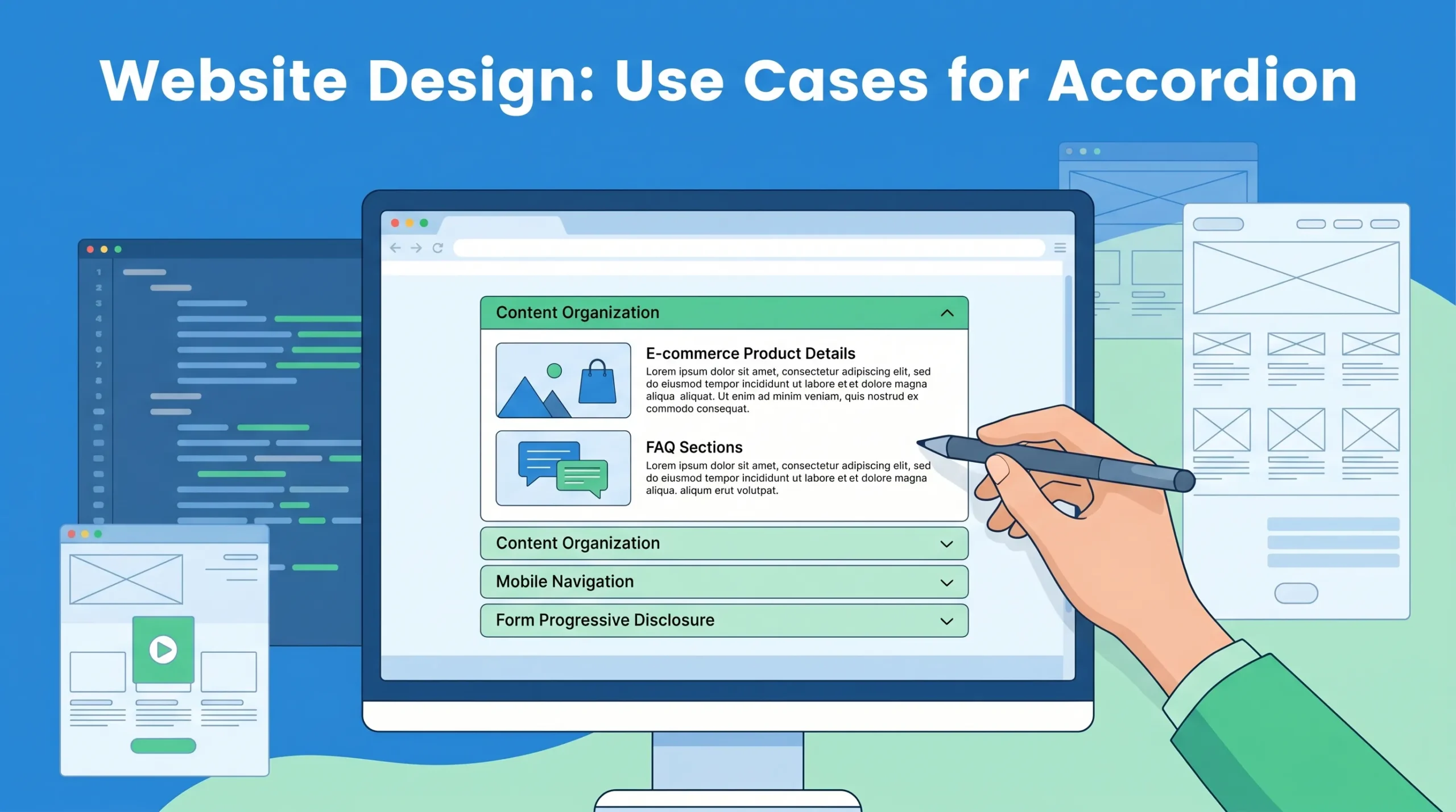
Common Applications: FAQs, Menus, Product Details
You see accordions in many places across the web. One of the most common uses is in FAQ sections. Here, an accordion lets visitors open only the questions they care about. This keeps the page tidy and helps users find answers quickly. You also find accordion form design in product details on eCommerce sites. When you shop online, you often want to see specifications, reviews, or extra information. An accordion lets you expand these details without leaving the main product page. This makes shopping easier and more enjoyable.
Menus and navigation benefit from accordion design as well. On mobile devices, space is limited. An accordion menu keeps navigation compact and easy to use. You can expand only the section you need, which prevents information overload.
Here are some frequent use cases for accordions:
-
FAQs (Frequently Asked Questions): Users find answers without scrolling through every question.
-
Product details and descriptions: Shoppers view specs, reviews, and more in expandable sections.
-
Menus and navigation: Compact menus work well on mobile and desktop.
-
Forms and filters: Accordion form design groups related fields, making complex forms easier to complete.
-
Content-rich dashboards or knowledge bases: Break up long content into smaller, readable chunks.
-
Step-by-step onboarding: Show one stage at a time to guide users through a process.
-
Pricing and tier comparisons: Reveal add-ons or advanced features inside expandable rows.
You may notice that eCommerce sites use accordions more each year. Online sales channels for accordions are projected to reach over 32% of the market by 2025, up from 19% in 2020. Educational websites also use accordions more often, as they help organize lessons and resources for students.
When you design for mobile, accordions become essential. They help users navigate and absorb information on small screens. However, you should make sure your accordion is easy to tap and expand. If users struggle to open sections, they may become frustrated. Always test your accordion form design on different devices to ensure a smooth experience.
Best Practices for Accessibility
Keyboard and Screen Reader Support
You must make your accordion accessible for everyone, including people who use keyboards or screen readers. Start by using proper heading markup. This helps users with assistive technology navigate your content. Always use a button element for the trigger, not a link. Add ARIA attributes like aria-expanded and aria-controls to each button. These attributes tell screen readers if a section is open or closed.
When you design an accordion, make sure users can move between headers with the Tab key. They should open or close sections using Enter or Space. Focus indicators, such as a border or background change, show users where they are on the page.
Keep the tab order logical so users do not get lost. Test your accordion with screen readers like NVDA or VoiceOver. This ensures everyone can access your content.
Common accessibility issues include poor screen reader compatibility, missing keyboard navigation, and lack of semantic HTML. The table below shows some frequent problems:
|
Accessibility Issue |
Description |
|---|---|
|
Screen Reader Compatibility |
Users may struggle if accordions are not properly structured. |
|
Keyboard Navigation |
Keyboard-only users may find navigation difficult without key support. |
|
Semantic HTML and ARIA |
Missing ARIA attributes can confuse assistive technologies. |
Tip: Maintain a minimum color contrast ratio of 4.5:1 for text and backgrounds. This helps users with low vision read your accordion content.
Design Tips for Effective Accordions
You improve usability when you follow clear design guidelines. Each section should have a concise, descriptive heading. Make both the header and icon clickable for better interaction. Use hover effects and visual cues, like chevrons or plus icons, to show which sections can expand. When a section opens, change the visual indicator so users know new content is visible.
Keep your accordion consistent in style and order sections logically.
Responsive design is important. Adjust icon and text sizes for different screens. This makes your accordion easy to use on both desktop and mobile devices. Animations can help users see when content expands or collapses, but keep them simple. The table below lists helpful design tips:
|
Design Tip |
Description |
|---|---|
|
Clear Labeling |
Use concise headers for each section. |
|
Clickable Elements |
Make both header and icon interactive. |
|
Hover Effects |
Show interactivity with color or shadow changes. |
|
Visual Distinction |
Make expanded content stand out visually. |
|
Consistent Styling |
Use the same style for all sections. |
|
Responsive Design |
Adjust layout for different screen sizes. |
|
Animations |
Add simple animations for expanding or collapsing content. |
You create a better experience for all users when you test your accordion with both keyboard and screen reader tools. This ensures your responsive design works well for everyone.